
Me gusta:
(3 votes)
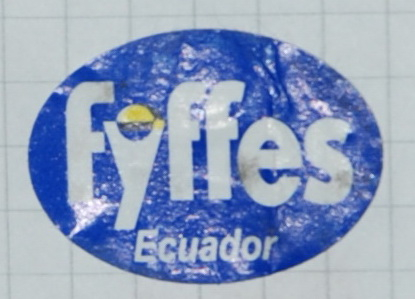
Fecha de edición:
1999
País:
- Ecuador
Material:
- Papel
Color:
- Blanco, Amarillo, Azul
Forma:
- Oval: Nivel con curvas
Ancho:
28
Altitud:
20
Motivo:
- Trademark & Logo
Texto impreso:
Fyffes Ecuador
Entrada de catálogo:
- F›Fyffes›Fyffes: Blue Label, Classic›Fyffes: Semicircle & Country Name
Post date:
Jul 2014
Last modified:
Oct 2019
Comentarios
got a similar one from 2017
got a similar one from 2017
For me, there is a clar
For me, there is a clear difference between both labels. "ECUADOR" is printed in a thick font, and on thre other in a fine font. Besides this difference, the position of "ECUADOR" is different with wider and narrow gap wit the "Y" of Fyffes.
On one hand I agree with you,
On one hand I agree with you, it's a bit different. On the other it's getting hard to try to find something going through all these slightly different variants of the same label.
Would be nice to have a clear criteria where is just a small tweak of the same label and where is a major difference that can be considered as a real new label.
Different text- yes, but more/less bold or a bit different colour(s)- I'm not sure